SaaS Website Redesign in Framer
Studio Vora redesigned Coassemble's Framer website to support two distinct SaaS products under one brand. The centrepiece: a persistent product toggle that switches the entire site between a Slack training tool and an embeddable developer platform - giving each product its own visual identity, messaging, and pricing without fragmenting the brand.
SaaS
Framer
Web Design
EdTech

Project Overview
One brand, two SaaS products, one Framer website
Coassemble helps organisations transform company knowledge into structured learning experiences. As their product strategy matured, they launched two offerings targeting fundamentally different audiences: operations teams using Slack, and developers building embedded learning infrastructure.
Coassemble needed a website redesign that would give each product its own voice without fragmenting the brand.
Studio Vora designed four product-centric pages in Framer, connected by a persistent navigation toggle that lets visitors switch between product experiences in one click.
Client | Coassemble - EdTech / SaaS (Australia) |
Scope | 4 website pages designed and built in Framer |
Services | SaaS Web Design, Product Positioning, Visual Strategy, Framer Development |
Key Feature | Dual-product toggle navigation: one site, two experiences |
The Challenge
How do you redesign a SaaS website for two products without building two sites?
Coassemble's Slack product targets operations and L&D teams who want to deliver training where work already happens. The Embed product targets developers and product leaders evaluating build-vs-buy decisions for learning infrastructure. These are different buyers, different problems, and different visual languages but they need to live under the same brand.
We needed a navigation model that makes both products immediately discoverable without forcing visitors to choose before they understand the options. A dropdown menu buries the distinction. Separate subdomains fragment the brand. We needed something in between.
Design Highlight
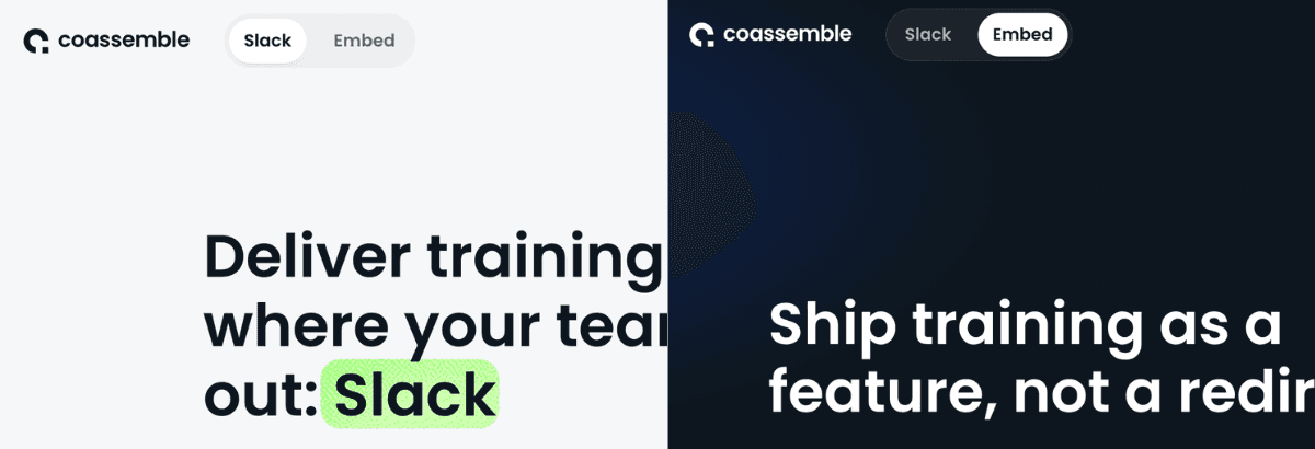
It was introduced a persistent toggle at the top of every page. Clicking "Slack" or "Embed" switches the entire website context while keeping the visitor on the same domain, under the same brand.
This pattern solves three problems at once. It makes both products visible from the moment someone lands. It lets each product tell its own story with its own visual language. And it keeps the brand unified: visitors always know they're on Coassemble, no matter which product they're exploring.
Product 1: Slack training
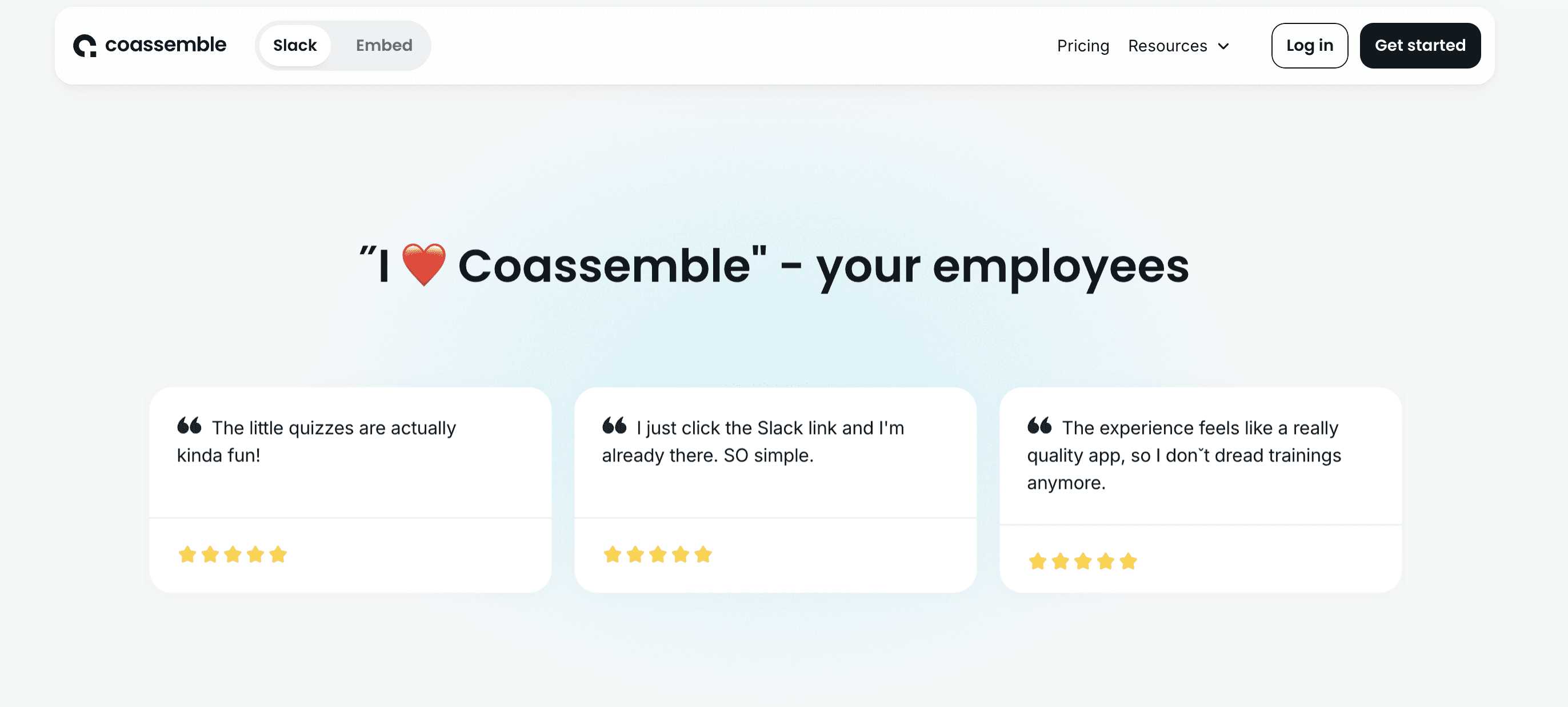
The Slack product page was designed from a wireframe and copy provided by Coassemble. Studio Vora translated this into a fully designed Framer page with a light, approachable visual system.
The page structure follows a problem-to-solution narrative: scattered training across Slack channels, docs, and videos is the pain point. Social proof and customer testimonials are woven throughout to build trust with operations and L&D buyers.
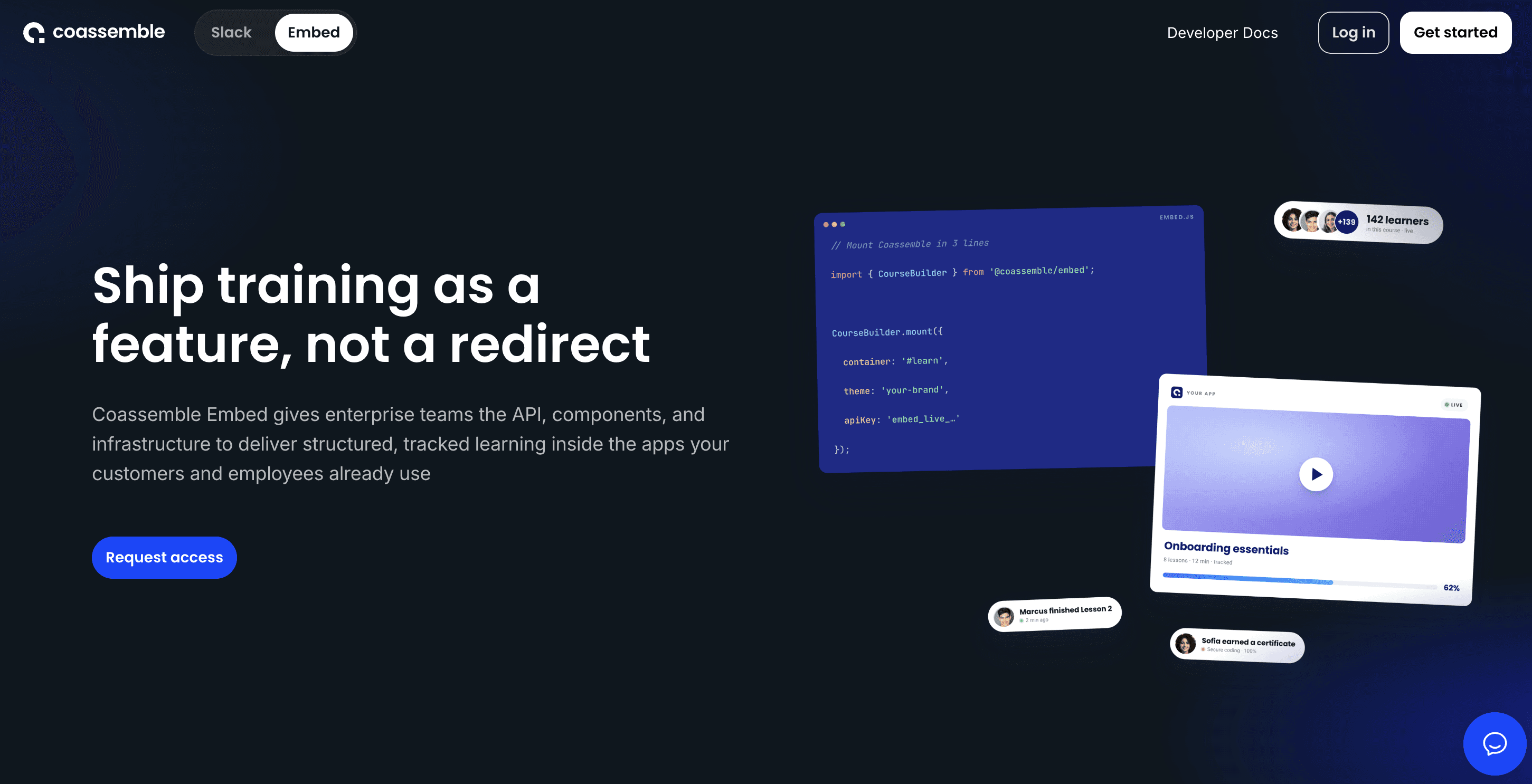
Product 2: Embeddable learning infrastructure for developer teams
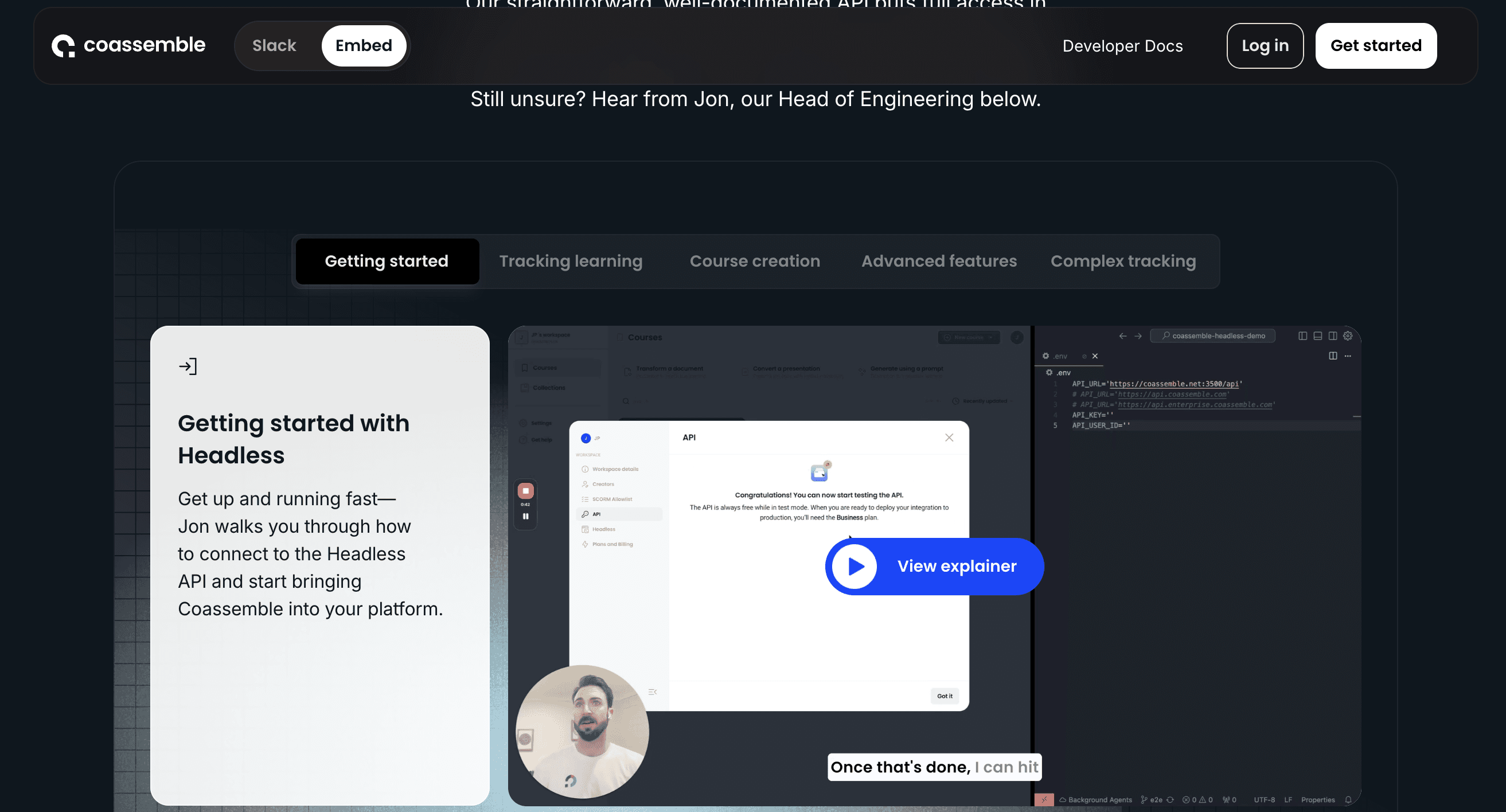
The Embed page already existed on Coassemble's website but needed a complete redesign to align with the new product-led positioning. We shifted the visual language to a dark, developer-oriented palette - deep navy, code snippets, and architectural diagrams - signaling a fundamentally different audience and product category.
The page communicates API-first infrastructure, use case breakdowns, and procurement-friendly pricing. Every element was designed to resonate with engineering leaders and product managers evaluating SaaS integrations.
Design Process
From product strategy to Framer-ready designs
01: Product & Messaging Alignment Reviewed Coassemble's evolving product strategy and defined how each offering should be positioned on the website.
02: Dual Visual Systems Developed two complementary design directions: light and energetic for the Slack product, dark and technical for Embed —> connected by shared typography, spacing, and layout patterns that maintain brand cohesion.
03: High-Fidelity Page Design Designed all four pages at full fidelity: the Slack product page from wireframe, the Embed page as a ground-up redesign, and two product-specific pricing pages with responsive layouts.
04: Framer Development & Handoff All designs were built and optimised for Framer's component system, ensuring responsive behaviour across breakpoints and seamless content management for Coassemble's team.
Outcomes
Slack Page: Slack product, designed from wireframe and copy
Embed Developer Page: Full redesign of layout, hierarchy, and visual direction
Pricing Page - Slack: Self-serve tiered pricing with monthly/yearly toggle
Pricing Page - Embed: Enterprise and procurement-focused pricing
The site now communicates what each product does, who it's for, and why it matters within seconds of landing.
Need a Framer website that actually reflects your product strategy?
Whether you're launching a new product, repositioning an existing one, or outgrowing a single-page approach - Studio Vora designs SaaS websites in Framer that are built to convert.